
Hello, everyone, another cold Monday here. Tonight the wind is a bit less and the air is so invigorating, the sky is [trite but true] like black velvet scattered with a million brilliant diamonds.
In Friday's post I showed you my finished top for the historic quilt-along on Barbara Brackman's blog. Her new sewalong has begun, much anticipated by me since I skipped 2017. This year's history/ story is about the lives, letters and album quilts made by young girls before the Civil War, in both the North and the South, though presumably there was no such rigid division as early as 1840, unless we face reality and call the states Slave and Free?
It was a fad back in the 1840s and 1850s to make signature or friendship quilts. Each of one's girlfriends would make a block and sign it, as a remembrance of school days and classmates.

Sort of like we used to sign yearbooks, I guess. Or remember those funny autograph hounds, cotton dachshunds. I was pretty surprised when one of my kids got one for a party gift, who knew they still exist?
But now I have the quandary of What my Album quilt should look like. Not a scrap quilt; these were spoiled, pampered, very well to do young ladies who could easily afford to buy a certain color that the honoree might demand.
A designated palette is in order. I have three ideas:
1-Taupe/mud/neutral, with light ground text fabric for the light.


The selvedge here shows the colors I would be using.

I got this group of prints specifically for this project last fall. And I added a few greyer prints, and a fun bird print for fussy cutting.

But, though I love dry-mud color or taupe, I fear this might appear very dull and sad in a quilt. And I def do not want the accent color to be mustard, I don't think a grey and yellow modern palette works at all. [And I hate it.] The accent will need to be black.


But still. Yawn?
then 2- These authentic brilliant prints are from a group called Jamestown, which is confusing as Jamestown reeks of 1600 taupe and starving colonists. The allusion of the name escapes me. The colors are so ''me'', so fun and lively. But perhaps anachronistic? Seems to me they date from about 1875-90 or so.

And picturing them made up I am seeing a truly hideous quilt, even if again lightened with the white ground writing print.

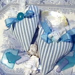
3- Blue. Indigo blue. Oh okay,let's make this a beautiful and usable, if crushingly boring blue and white quilt. My [imaginary]schoolgirl loves blue and simply asked her girls to make blue blocks. She's a bit less of a lahdidah princess of the old south, maybe she is from Ohio or Illinois. New York? I don't have a photo of blues, but here is Bitty, similarly blue and ''white', and blue hearts:


My quilt will have alternating spacer blocks for a total of 25? blocks. The spacers will be Double Nine Patch or Four Patch Nine Patch. In the sewalong Pinterest board Brackman shows a spacer, but it isn't yet mentioned. Too fussy for me; the nine patch variations will make a strong diagonal secondary pattern too. Like this:
 |

I'm pretty sure I will use these, though that leaves a big light hole in the center of each block. I don't have a light box for tracing so I printed the writing on my computer, on muslin. Supposedly printer ink is water soluble but I've had good luck with ironing well then spraying it with matte acrylic sealant. I also will enhance the writing between ironing and spraying, using Pigma pens.

I wasted a sheet of the printer fabric making and experimental square for the washing machine test.

So what do you all think!?
Mo chimes in, "Moooom, does this t shirt make my butt look fat?" He doesn't like quilts until they're at the lying on stage.

Opinions, please. While we decide, I will be sewing the 40-odd Flying Geese for my Fall Festival quilt. It has waited patiently for many months to be finished.

love
lizzy
gone to the beach...
thinking of summer days...


.jpg)


I look forward to following your progress! So you chose to do it in blue and white?
ReplyDeleteMy Fall Festival is on the way back from the quilter! Yay!
Choices, choices!! I kind of like the taupe/mud colors, believe it or not. Maybe a practical-minded girl, perhaps one who's thinking ahead to marriage, would choose it as something that wouldn't show wear or dirt?
ReplyDeleteThat said, I would actually pick the Jamestown colors. I think they look like Virginia spring wildflowers, cheerful. (LOL, you just don't like it because of all the green!!) It would be a happy, cheerful quilt.
I also think you ought to freehand the 'signatures' on maybe a solid color to go with the block they'll be in, and use your friends' names - current friends or from your childhood. You are artistic and could make them look nice, and they'd be original!
My mom made a friendship quilt for a friend who was moving away in the late 60s. I thought it was cool even when I was a kid.
Whichever palette you chose, I'm sure it will come out really nice!
Somehow I think you will be using blues! I am partial to gray. Hmmm. Since I will be participating in the Antebellum quilt project, I best get my fabrics lined up. Just visualizing Gone With The Wind, Scarlet and her entourage (Fiddley Dee!). Love the bird fabric. Actually, I love just about any bird fabric! By the way, please tell Mo the tee shirt does not make his caboose look big. He looks good in anything. Love to you and Baby Mo.
ReplyDeleteI don't know which color grouping you will choose to use, but I sure do like the colors of that practice signature block!
ReplyDeleteI haven't decided what colour/s I'd like yet. I thought a two colour quilt would be nice.
ReplyDeleteI did a signature block with one of the Yahoo groups years ago and made all the blocks into a quilt. I also got the ladies I'd quilted with here in Aus. to do a block too so I ended up with quite a number.
I think you are on the right track colorwise. Those light prints look antebellum to me. The purples, greens yellow might be hideous without some neutrals to space them out. Throw them all in a basket and shake it up.
ReplyDeleteJeeze, I would never be able to decide...except maybe not the Jamestown collection. I'm sure whether you use the blues, or tapes, you'll do a great job!
ReplyDeleteYes Mo, yes it does, lol.
Kel
You're spoilt for choice. I always find it difficult choosing the final combination as they're all so tempting. I agree with you on the inclusion of black as an accent. That irregular blue spot speaks to me.
ReplyDeleteI'm torn between our traditional indigo Shwe Shwe with perhaps close tones and pales or low-key dull turquoises and sea tones - along the lines of your lovely beach pics!
It will be fun to see your choice. Penny